The Brief
The Vegan Kind is an E-commerce supermarket, catering to customers who lead a vegan or plant based lifestyle. Despite growth within the company, their website hadn't been updated in a while, which was resulting in loss of sales, a drop in click through rates and a high drop off rate when shopping.
I was briefed with designing a brand new E-commerce website for the brand, in order to improve sales and overall customer retention.
The Current Website
The Vegan Kind's current website could be described as a 'patchwork' project, with various sections being added over the years, without a clear or cohesive design strategy. This has resulted in the website having a non unified and clunky look, which users may find hard to navigate and search for what they need.
Despite primarily being an E-commerce supermarket, the website's landing page doesn't fully communicate this. Instead, users are taken to a landing page which tells them about the company, showing a display tab for the supermarket and another for their monthly subscription box service.
Users are only able to access the full supermarket page by clicking on either the display header box, or the somewhat not obvious link in the navigation bar.
Despite over 80% of current users accessing the website via their mobile device, the mobile website is not optimised to the optimum level, which user reports have shown has led to a high drop-off level and low click through rate on mobile platforms.
One of the most obvious areas in which the non optimised mobile experience is evidence is within the navigation. Rather than having a clear and structured navigation flow, users are met with a scrolling navigation, where they are expected to horizontal scroll in order to see the entire list of options. This outdated UI feature not only gives the website a clunky appearance, but heat maps also show that users simply aren't scrolling, with links that are towards the end of the navigation receiving almost zero clicks.
Initial Focus Group
In order to gauge opinion on the current site, in order to start sketching a new design that is based on user insights and real world feedback, a small focus group was set up. The participants were selected internally within The Vegan Kind employee network, ranging across a large scope of business areas such as sales, warehouse, buying and directors. A conscious effort was made to not include employees who worked within the design, development or engineering team, in order to prevent biased results.
20 participants in total took part in the focus group and were asked a set of 20 yes/no questions in order to gain quantitive insights about the current site, as well as an additional comment question, in order to gauge more qualitative opinion.
The results revealed some valuable insights, for example:
- When asked if the current website's purpose as an e-commerce supermarket feels obvious when first accessing the site, 83% of participants said no, with only 17% answering yes.
- A massive 92% of participants answered no when asked if the current mobile website is full optimised for mobile platforms, with only 8% answering yes.
- When asked if the current look and feel of the website's design fully corresponds to the company branding identity, feelings were more mixed, with 55% of participants saying no and 45% answering yes.
- Opinion was of a similar mixed nature when asked if users were able to easily find what they were looking for when accessing the site, with 60% of participants saying no and 40% saying yes.
- When asked if the current website's navigation layout was user friendly and easy to navigate, a whopping 95% of participants said said no, with only 5% saying yes.
- Valuable competitor insight was also gained when asked if participants felt that the current website was up to the standard of other e-commerce supermarkets and plant based shopping sites, with 85% saying yes and only 15% saying yes.
As well as this valuable quantitive insight, interesting qualitative and opinion based information was gained when users were asked to give any additional comments about the site, for example -
" I think having two landing pages is now redundant as over 70% of our business is now conducted within the supermarket. Having the information and blog page was useful when the company was first starting out, but we have now out grown it and I feel that the main aspect of the website should be the supermarket, with the subscription boxes being a secondary header link."
"If I didn't work here, I don't think I would realise that this is a supermarket when accessing the site. Maybe there is a way where we could combine both the supermarket and subscription box aspects into one big landing page?"
"I think the website needs to primarily be a supermarket with the subscription boxes being a secondary feature, similar to how Ocado have their home delivery service displayed."
"The website's navigation needs a complete overhaul! Everything is just lumped into one big category, we need to separate and categorise items similarly to how Tesco, ASDA and Ocado do it - Let's follow the market leaders!"
"I find it really hard to find anything I'm looking for on the current website because the navigation is so unorganised, this should be the first focus point in my opinion."
"I mainly use my mobile to browse the internet nowadays, but I absolutely hate our current mobile site and always order any items using the desktop site on my laptop. The mobile site just feels so clunky and unresponsive and I'm not a fan of the scrolling navigation either - it needs a total overhaul in my opinion!"
"Our mobile website feels extremely dated and I find the design to be not very user friendly. I think we should take some visual cues from Ocado and Tesco, two supermarkets that I frequently buy items from using my mobile phone."
Focus Group Takeaways
It's obvious from the focus group results that there are a lot of potential improvements that could be made on the current site. The main recurring themes of the results were that participants felt that the website's navigation needed to be arranged and categorised better, with a fresh design that would make it more user friendly and easier to navigate.
The mobile website's navigation was also a key theme, with many stating that they didn't like the scrolling design, feeling that a more simple user interface would be much more effective.
The other recurring opinion was that the supermarket aspects of the website should be the main landing page, with the subscription box feature being secondary.
When first analysing the results I began to create some low-fi prototypes of how the site could look with a new landing page that combined both the supermarket and subscription box aspects, using the current navigation -


However, it began to become apparent to me that in order to fully address the confusing nature of the current landing page, the main root of the issue would first have to be addressed - the navigation.
The Navigation
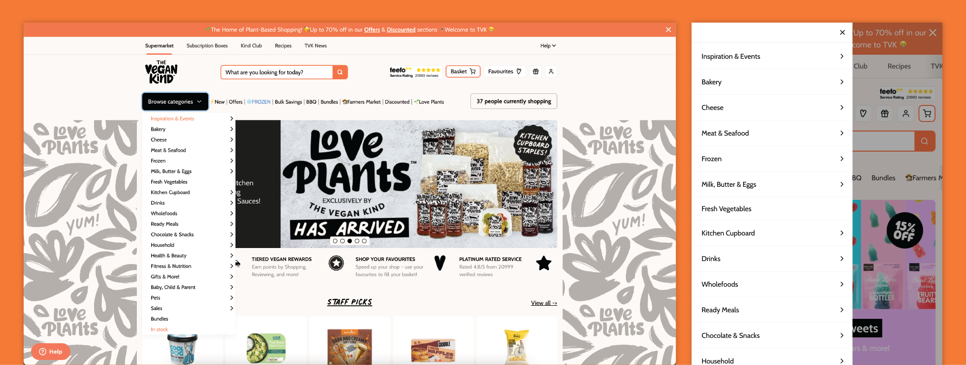
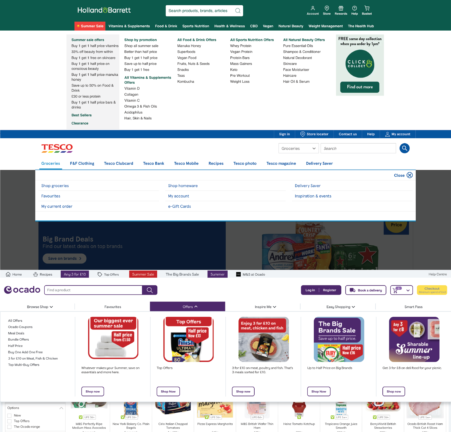
When approaching a new design for the website's navigation, I felt that it would be useful to firstly do some research into how other competitors approached their navigation structure.
Two competitor names that continuously came up in the focus group were Ocado and Tesco, however I also felt that Holland & Barratt would be a good place to analyse, given the similar audience share and target market.
The navigation on the current site follows a vertical design, which creates usability issues. Due tot he many unorganised categories, the navigation can fall off the page on certain devices, meaning that users will often having to vertical scroll in order to see all options.
When looking at competitors, it also quickly became apparent that most if not all used a horizontal navigation design instead. This design style makes much better use of the available space, meaning that the vast navigation links have plenty of room to display without feeling cramped, and also eliminates the need for users to vertical scroll.
I therefore felt that it would be worthwhile to test a horizontal version of the navigation, however it was also obvious that the current navigation would have to be re-organised in order to improve the user interface.
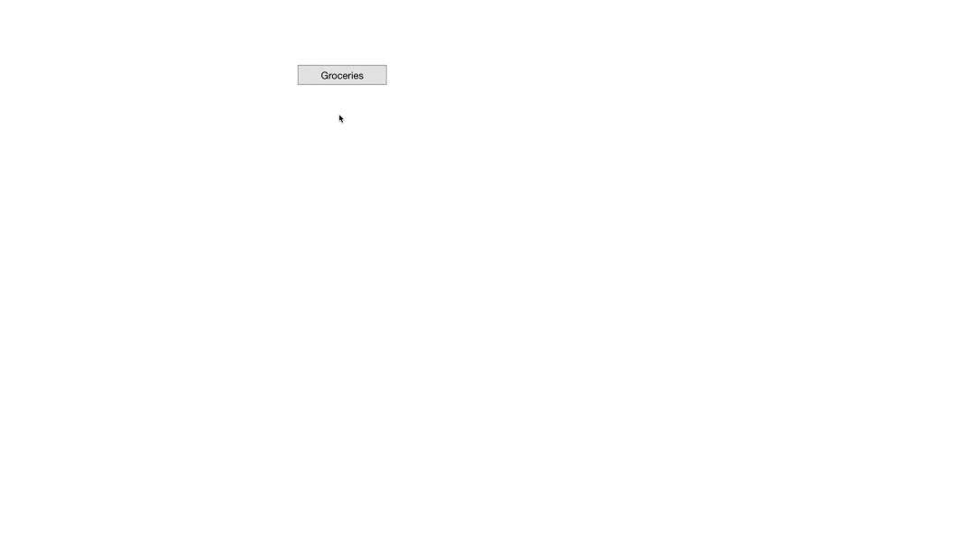
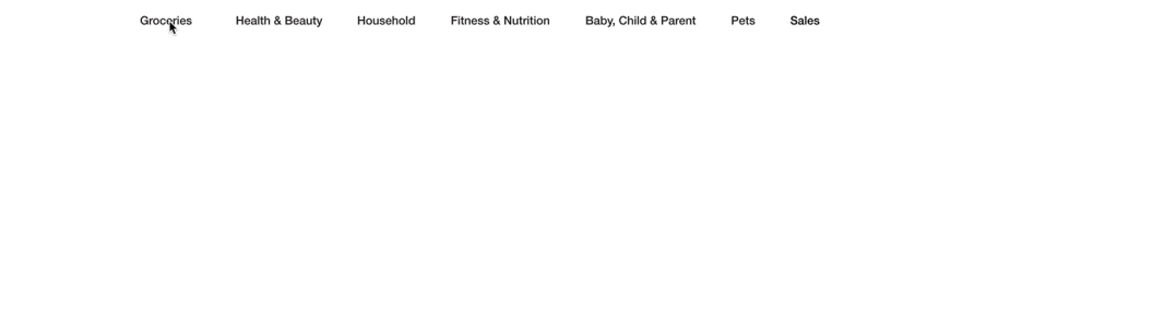
I then began the process of shifting through the current navigation, identifying key grouping areas. After much planning, I decided to separate the categories into 7 key areas - Groceries, Health & Beauty, Household, Fitness & Nutrition, Baby, Child & Parent, Pets & Sale.
With these new sections organised, I began to test and create wireframes on how this new navigation structure could work -
Then progressing into a more detailed, lo-fi prototype -
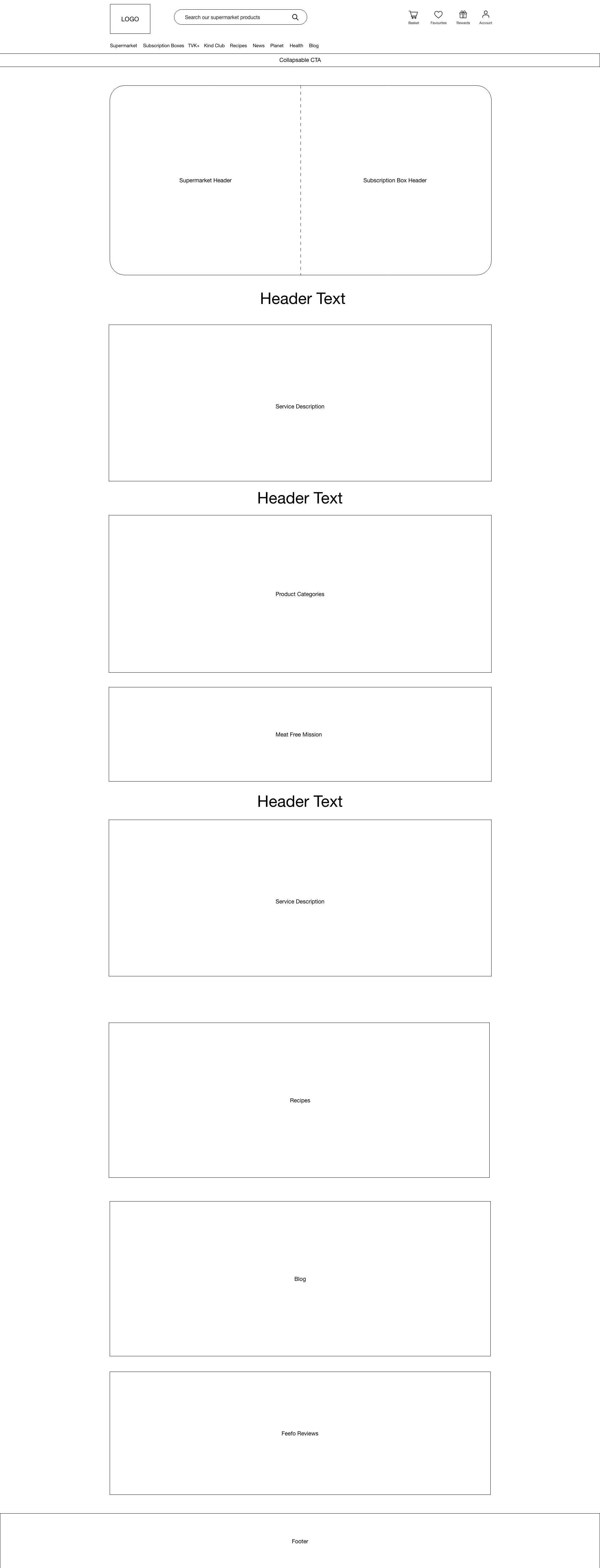
When I had decided on a new navigation structure, I then decided to mock up some wireframes of how the navigation could look on the site. The results of the focus group showed that the majority of participants would like to see a combination of both the supermarket and subscription boxes, therefore I decided to create one navigation that incorporated both.
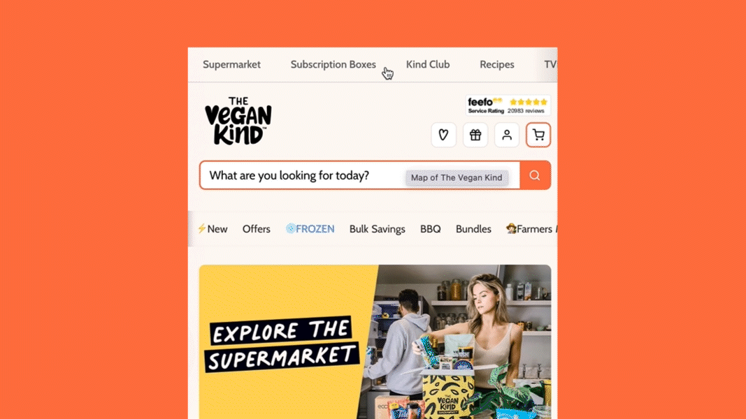
The end result is a main portal that features relevant links for both areas of the site, but in one place. The various sections of the website such as supermarket, subscription boxes, blog and news have been moved to the top of the page, alongside a basket and account CTA, with the supermarket categories being moved to it's own section underneath the search bar.
I feel that separating the navigation in this way allows the key areas to be displayed, whilst keeping the supermarket categories as the main focal point.

Desktop Navigation Structure
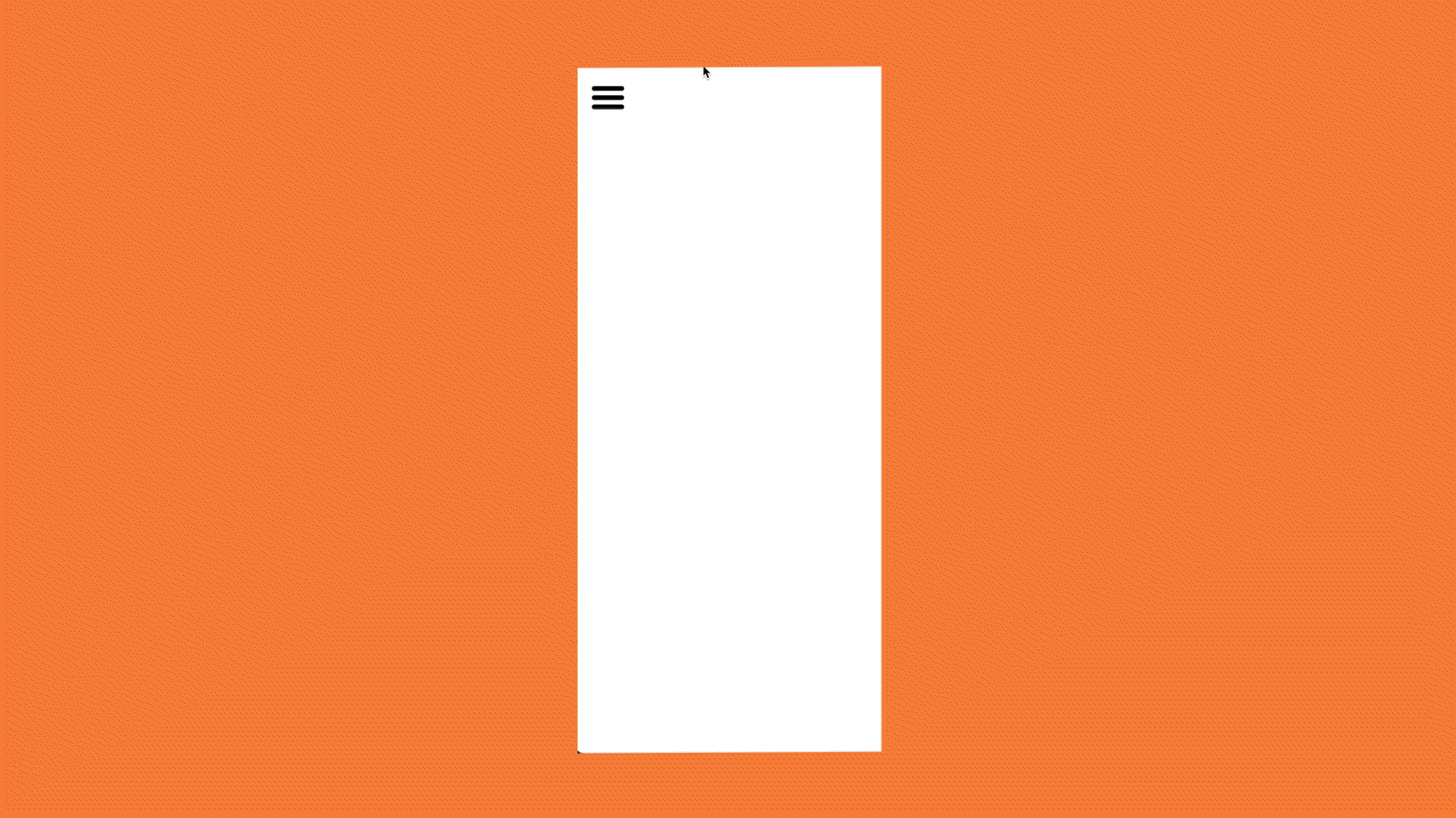
Mobile structure wireframe
Homepage
The next stage of the design process was to approach the site's homepage. The results of the focus group made it clear that the main issue to be addressed was the two landing pages, with the majority feeling that having both was redundant, and one combined page would be much more effective.
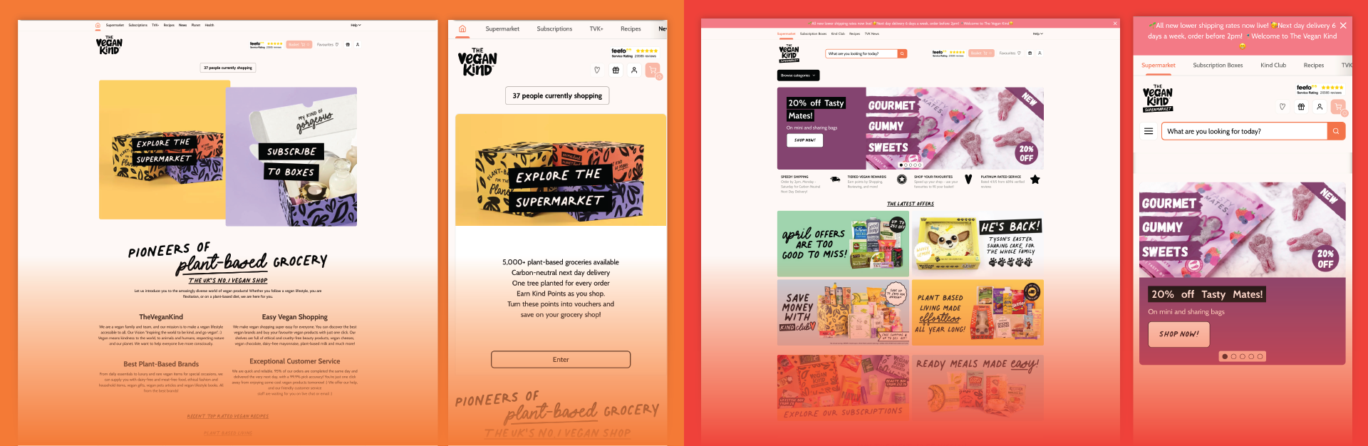
In order to gauge what the best design solution to this could be, I once again had a look at various competitors -
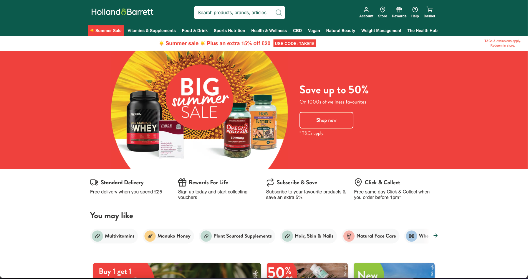
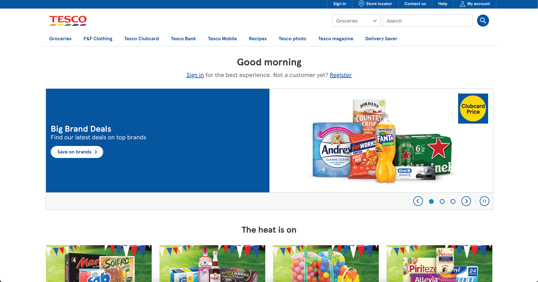
When looking at the competitors, one thing that became clear is that although each brand delivered multiple other features such as loyalty systems, blogs and news sections, each one made their supermarket the main focal point, with their other products featured in headers and call to action buttons.
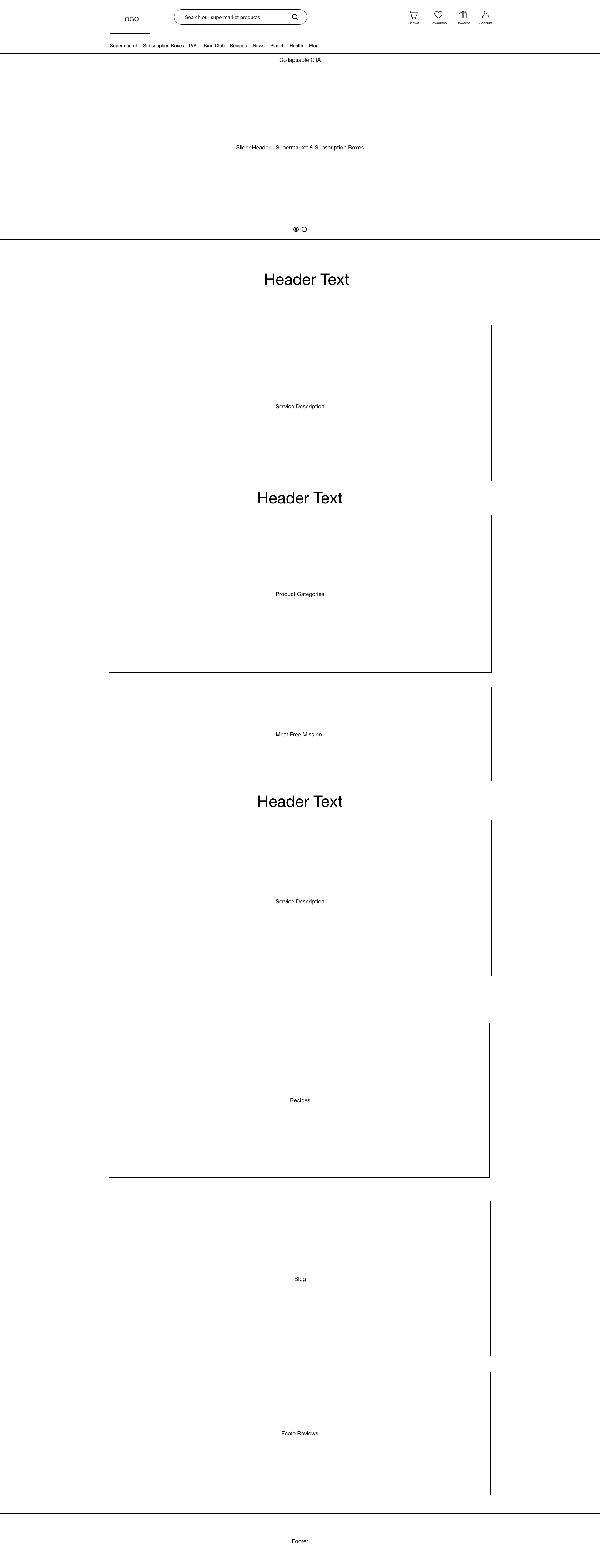
With this in mind I began to create some homepage wireframes which feature the supermarket as the main page feature, with headers and separate icons to indicate other sections.
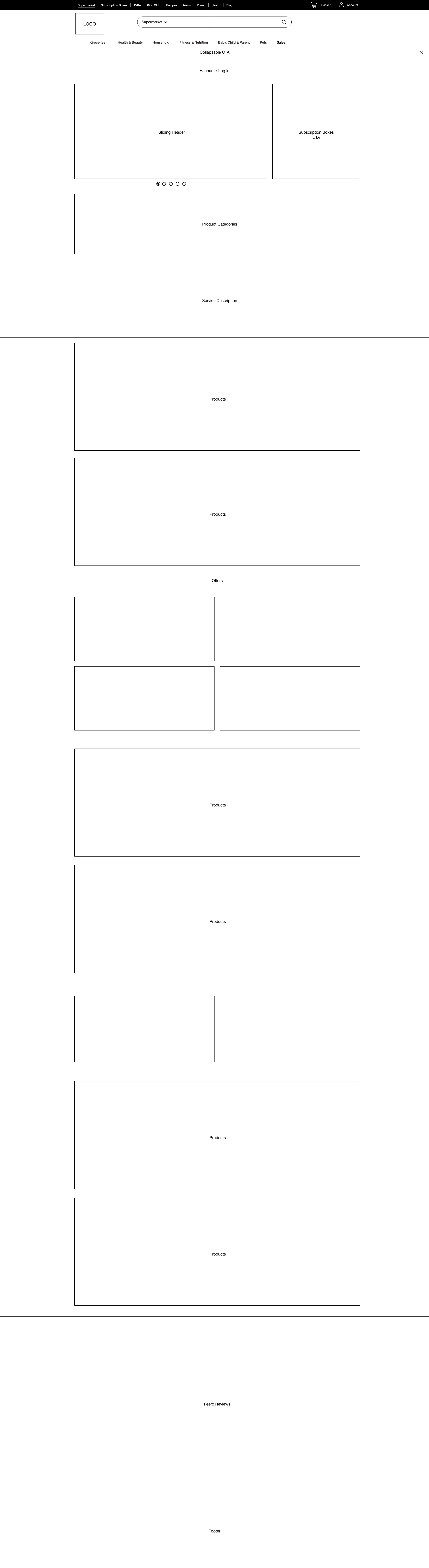

The wireframe utilises the new navigation style and also combines both the supermarket and subscription boxes. Underneath the header, the page's main focus is a sliding header, which alternates various slides with new product offers. Beside this is a static button which takes users to the subscription boxes page.
The content on the page is a mix of products and and offer banners, making the supermarket products the focus of the page, whilst still maintaining the character of the brand.
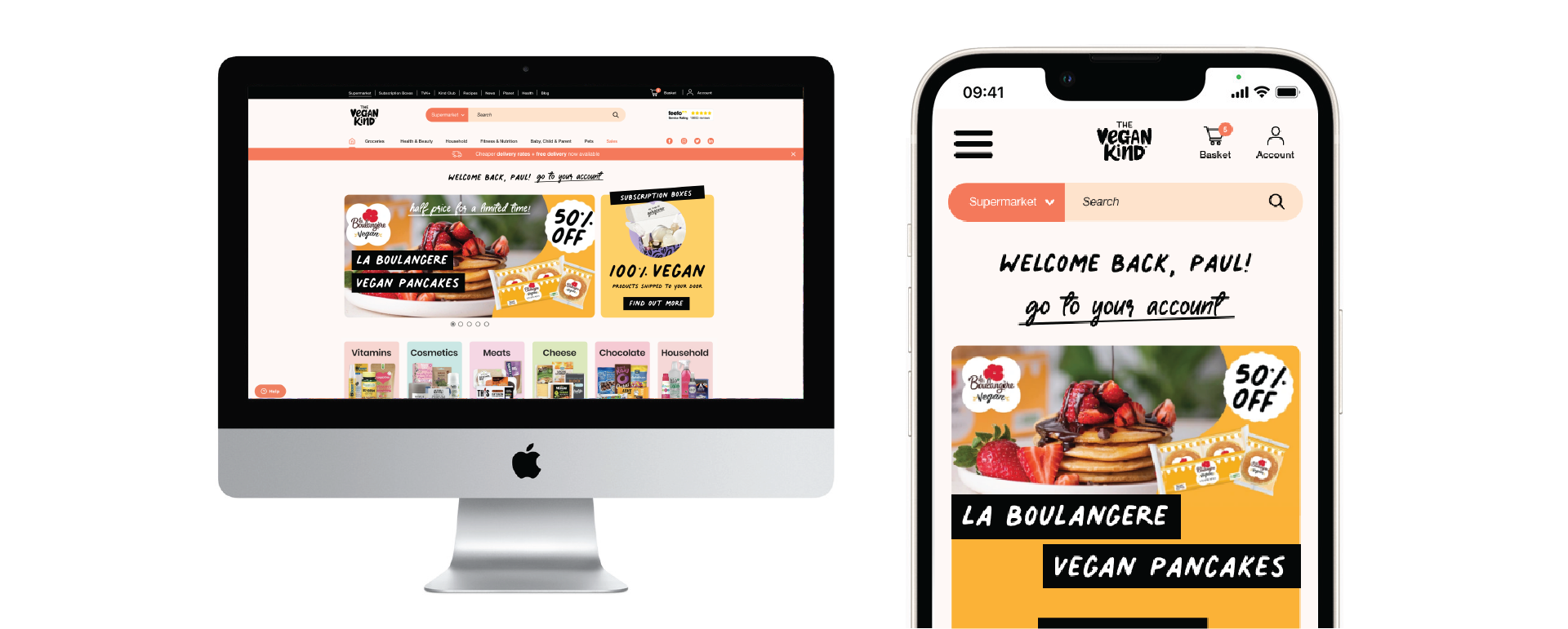
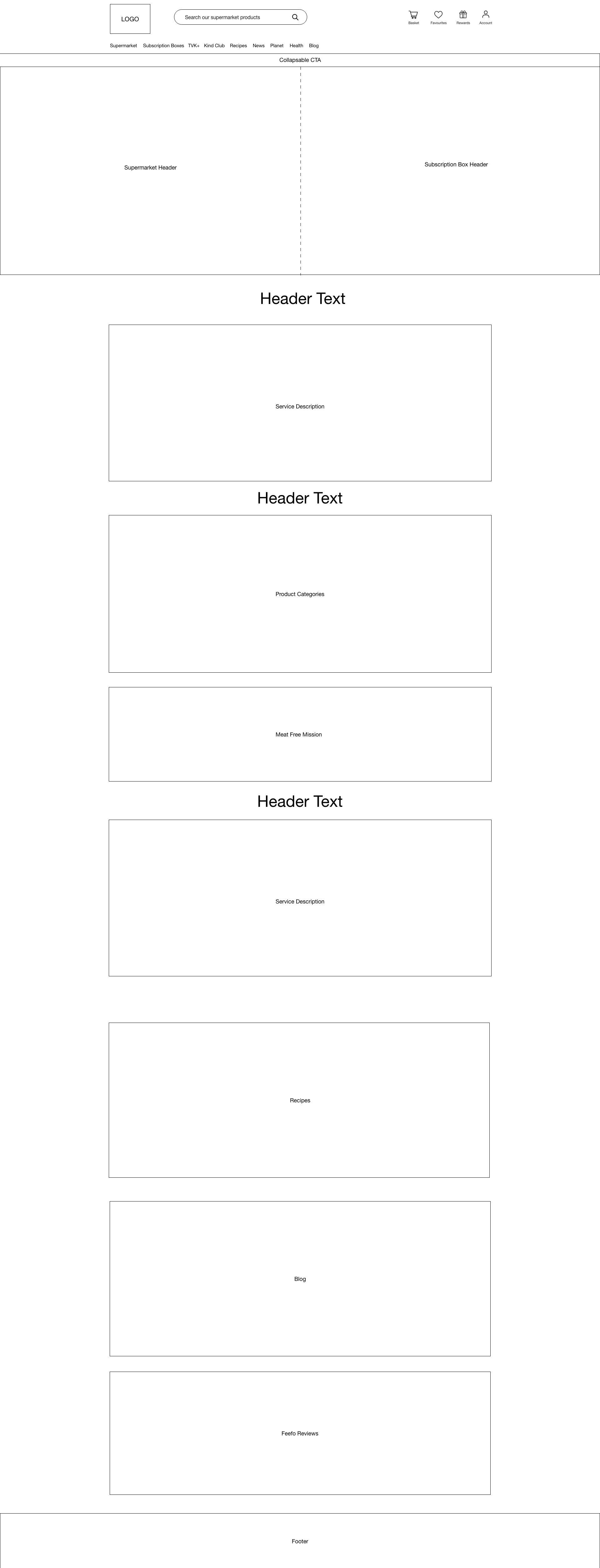
Final Hi-Fi Wireframes
Mobile Design -

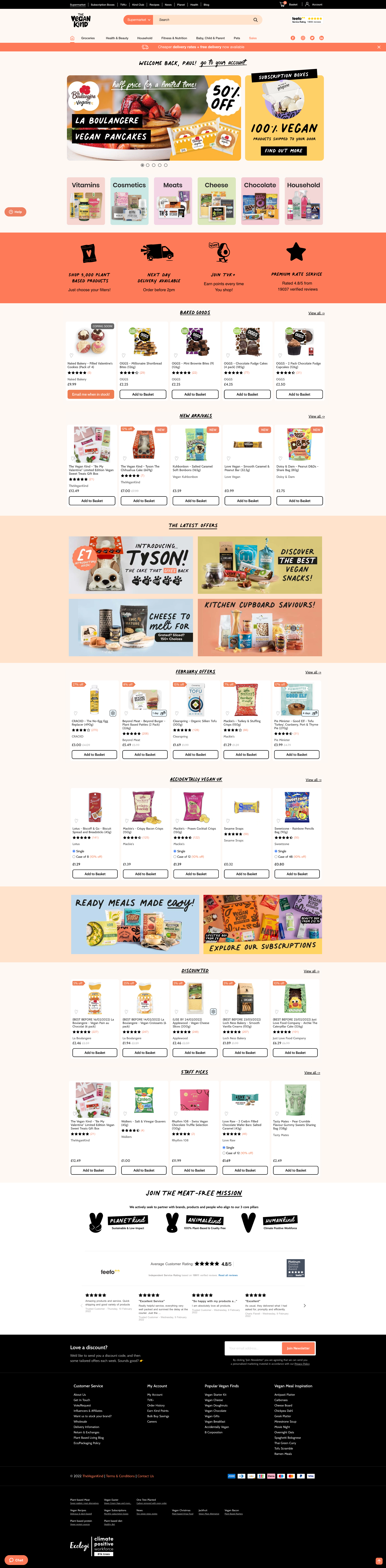
Desktop Design -
The final design is currently being developed and will then be put through user testing, before being shipped in the coming months.